Monday 21 September 2015

Designs of the Year 2015


Designs of the Year is an annual exhibition at The Design Museum showcasing the best of design from around the world in six categories: architecture, digital, fashion, graphics, product and transport. In each category a winner, the best of the best, is chosen by an independent jury.
We went as a family last year, 2014, which you can read here, where we had trouble agreeing on what we thought made for good design, our own judging criteria being far from independent. It's hard to agree on things when you know what you like and your mum thinks she know better. This year I went with friends, three women, three mums. What would we consider to be good design?

Firstly this.  


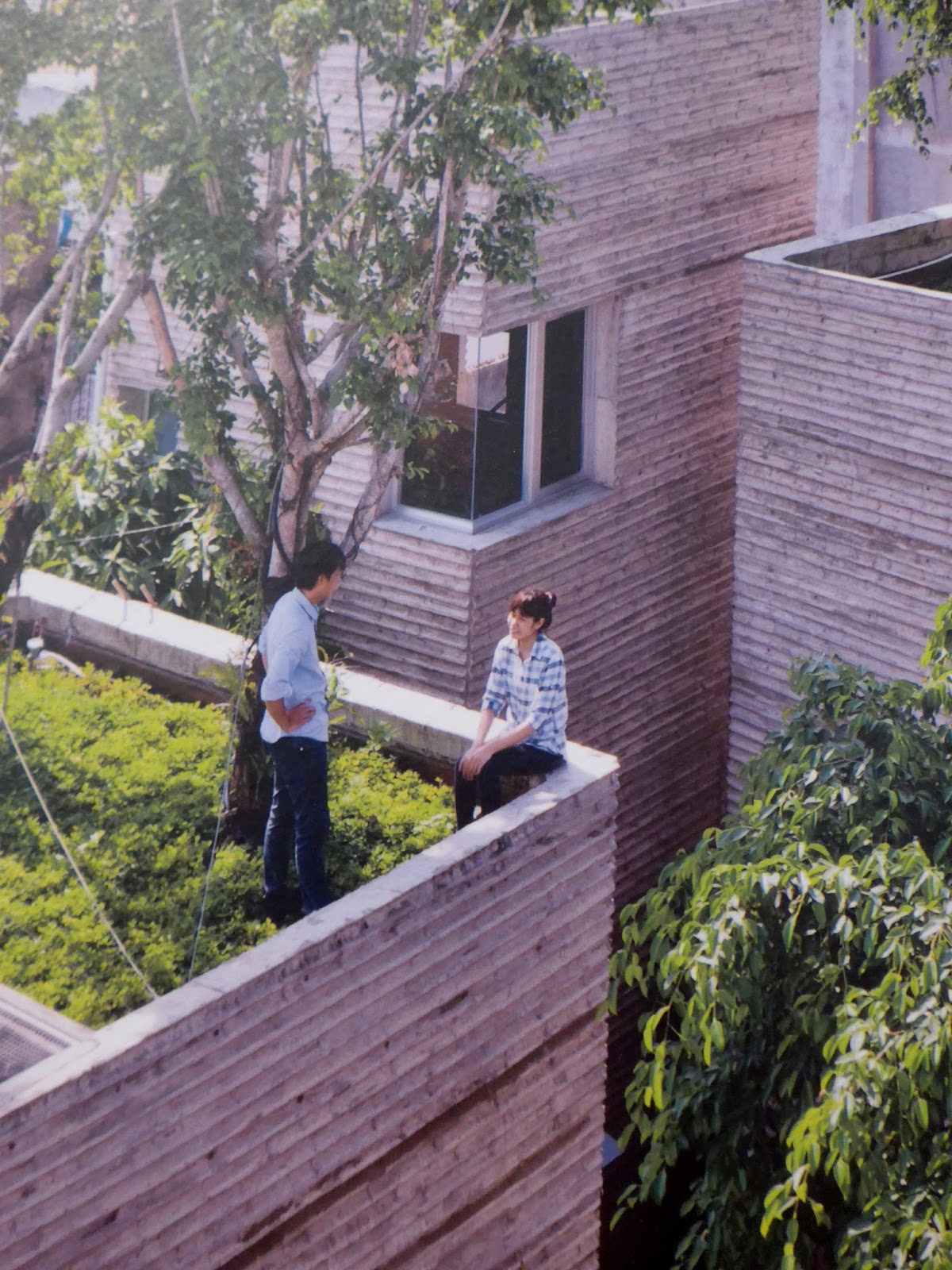
Plant pots to live in, bringing indigenous trees back into a city in Vietnam that is only 0.25 percent green. A kind of two birds and one stone design, helping with pollution and flood prevention.
Just one problem, "you couldn't seriously sit on that wall. Look at the drop".


Then there was tea, "I'd like that", just heating the water you need. Could this be the gadget that really does slot into everyday life and doesn't get resigned to the back of the cupboard after the initial enthusiasm has died down and you realise you haven't the space for it.


Then it gets clever, we all love this. Not only for the innovation, a table that can charge your phone using daylight, but who doesn't love a good pun, "Current table". It all happens by photosynthesis.


Saving on family squabbles, it is able to charge two phones at the same time.


Another design we could totally go with. "Inglorious Fruits and Vegetables".
Common sense, playful design promoting misshapen fruit and veg, making it "appealing and cool".


An attempt to reduce waste. We learn that fifty-seven percent of the 300 million tonnes of fruit and veg thrown away each year, is due to its appearance. Crazy! Get with it, shoppers, it's thirty percent cheaper too.


Then there are the designs we are thankful we don't have to rely on, but can still get very excited about. "How cool is this?" Without being connected to a water supply, sewers or mains electricity it provides hygienic sanitation.  


This toilet has everything covered. It's solar powered, waste water is cleaned, with chlorine produced through electrolysis, clean enough to wash your hands. Yes really. Waste material (you get my drift) is separated and collected to be converted into fertiliser and biogases. Practical, everyday design, yet its effects are huge. 1.8 million people die a year due to poor sanitation.


For some design, there's a story rather than an object on display. "The Ocean Cleanup", an "environmentally safe process" for removing the vast amount of plastic waste from our oceans. A project begun by a teenage engineering student, using the ocean currents to drive the rubbish towards floating barriers. 


We're convinced, however evidence is provided of the damage plastic waste does in our seas.

Not all the designs that impress us are about providing practical solutions and meeting needs, some is purely aesthetic and playful.


These designs for new Norwegian banknotes, combine two different designers' ideas, front and back. They work well together, kind of need each other. Two different designers saying, "I did that!"


"A streetlamp that plays with your shadow"


We had fun with this, as it recorded our shadow and played it back when the next person walked underneath. What I loved about this, is that it brought people out onto the quieter less explored streets of Bristol purely to search them out and play. One of our favourite designs in the exhibition.


As I said, we were three mums visiting, we have kids. How clever is this? Sensing labour is underway, it texts the farmer an hour before the calf is due. A design for animal welfare, but there are parallels.


Designs of the Year 2015 is on at the Design Museum until 31 march 2016.
This is our selection, there are many more design nominations, the best of 2015. Is this the stuff of future museums? As the Design Museums says,
"Someday the other museums will be showing this stuff".

Monday 14 September 2015

Kids...'Walk Through British Art'

'Walk Through British Art' is a series of galleries at Tate Britain which in their words is, "...a walk through time", through their collection from 1545 to the present. "There are no designated themes or movements; instead, you can see a range of art made at any one moment in an open conversational manner."


Fuelled by lunch, having seen the Barbara Hepworth exhibition, which you can read about here, we headed into the permanent galleries. I watched and chatted to my kids, intrigued to see how the Tate's 'open conversational manner' approach to displaying art worked itself out in our conversation.
What made them tick in the Tate?

Materials

Quite often it was the materials and the questions surrounding their use that drew in the kids, especially my youngest son and his friend.

Such as bread.
"Bread people".

"Do you think he bought sliced bread?
"How did he cut the bread to make room for the body shape? Did he cut round someone or use a mould of a person?"

"Bet it smells."

"I want to climb on them." Fortunately at 12 years old, he knew better.

Puzzles

Sometimes it was the challenge of a piece of art that captured the kids' imagination. Especially if the work presented itself as a bit of a puzzle.

Art in corners.
"I really can't tell if those shapes are printed on the wall or hanging there."

This was one of those pieces of work in a gallery that make you go and get your mum.
"Can I show you something really cool?"

"That's mad."
"That's not a hole is it? There's no way that's a hole."
We were so close, yet couldn't tell. Clever!


"Mum look, 3D or not 3D." He was pleased with himself for the pun.


Familiarity

We all like the work that reminded us of something, something within our experience.

"Do you remember seeing that Gilbert & George exhibition in Exeter?"

"That looks like Britain overcoming the Nazis in the Second World War. They start to break up, then at the end they are shattered apart."
We look at the label and find out that this was in fact made in the seventies. It is though, a comment on racism.
"Racism is breaking down. Good."


"I've seen this before. I like the colours, the splash." Says a teenager unafraid of colour.
"What even those greys?"
"Grey's not a horrible colour. You wear a lot of grey." True.


"I recognised that from the airport. I saw a security camera and the inside of a suitcase looked liked that."

Kids seem to want a work of art to be about something.
"What's this meant to be?"
"It's meant to be art."
"But what's it all about?"

So when no "about" is mentioned, they start to decide for themselves, more often than not applying concrete rather than abstract concepts.

"It looks like a ship."

"They look like singing worms."
"Friendly creatures."
"What is it about them that makes them look friendly?"

Hard Work

Hard work is acknowledged and respected.

"Those words must have taken a long time to do, especially if they did it manually", says a child from a digital age.

What they didn't get.

"How is that a work of art, it just looks like a messy room."
"That is not someone with a good life because they have mess all over their bed, things you don't really need. If they had a good life, they'd have a bedside light and loads of books."


The comments of two boys, not yet teenagers, on a comment made by the artist on her own life.
Do you think Tracy Emin has bedside light nowadays?"
Having a bedside light obviously says a lot about a person.

At this point, two delighted boys find and show us the smallest spider web, connecting her bedside table to her mattress. The Tate has a squatter, do they know? Does Tracy Emin know?


"What's the point? It's not saying anything important."
"It's a wire sculpture. Like a wire drawing. Sometimes when you draw, you make more than one line don't you. I think it's beautiful, a gentle, soft, wire drawing."


This was our conversation, Whether or not our responses were what the artists or Tate imagined, it's what we talked about. We would have liked a bit more "about" conversation with the Tate. When you're nine and twelve years old, it's important that galleries answer some of your questions. I reckon the Tate could have joined in a little more with the conversation, information was sparse.

As you can see, kids do get on with it, get engaged, make comments and stop themselves climbing on some very tempting pieces of sculpture, but at times things can come to a dead end.
"I don't know what it's supposed to be."

Tate Britain, Walk Through British Art galleries is free, open every day. What's stopping you visiting?
Unless you're scared of spiders.
Details on their website here.

Just in case you were wondering. It was a hole. I can't tell you how we found out, but I promise we did not touch the artwork.

UPDATE: To answer my son's questions about how Anthony Gormley cut the bread for the body shape in the sculpture above, We have since found out (from the telly) that he ate all the bread required to to make a 3D outline of himself. 

Sunday 6 September 2015

Museo Piaggio

Vespa Scooters are not technically my thing. I don't know much about tinkering with engines, and oil changes. I can appreciate cool though. And cool is what we got we got visiting Museo Piaggio in Pontedera, Italy.

We got cool, as in this, the Vespa Scooter,


...and cool, as we entered the air conditioned museum when it was forty degrees outside.


It's not all cylinder heads, top speeds and spark plugs. The Museo Piaggio knows how to appeal to many audiences.

Those who like a touch of Hollywood glamour.


Those who like colour.


Those who like the thrill of speed. Racing Vespas.


Those who like a bit of history.
Designed to be used in France in the Second World War, as far as I can remember.


And those who like to know how it all started.
The Vespa, designed Corradino d'Ascanio, an aeronautical engineer who who was not fond of 'uncomfortable and bulky' motorbikes, so set out to improve on them, designing the first in 1946.  


Since 1946 Vespas have been mass produced,


proving so popular that in the first ten years they sold one million,


and four years later, they had sold their two millionth Vespa.


The Vespa has also been subject to much customisation influenced by...

...helicopters


...aerodynamics


...TV programmes


 ..and meat.


Museo Piaggio is housed in an old Piaggio factory,


which was damaged by bombing in the Second World War.


Three years after the end of the second World War, and two years after the two wheeled Vespa scooter was designed, in the same year Italy became a republic, Piaggio launched the Ape, a three wheeled van. It has proved to be Italy's most popular goods vehicle, selling 200,000 in ten years.


As with the Vespa they soon moved on from post-war military paint colours.

To red, for fire engines,


and designs from Sicily.


The Ape has been tested to extremes with several round the world expeditions.


Including a six month, 25,000 kilometre, journey from Spain to China across twenty countries to celebrate the Ape's fiftieth anniversary.


If you fancy customising your own Vespa, you have the chance in the kids area.
My kids weren't really young enough but enjoyed the opportunity anyway.


The Vespa, so called because "sembra una vespa!", "it looks likes a wasp!".
Old and new, has it changed that much in sixty-nine years?


Museo Piaggio is air-conditioned and open Tuesday to Saturday and the occassional Sunday.
Check their website, here, before you visit as you might just turn up at 1pm on a Saturday when they're closed for an hour for lunch. Just time enough to pop into town for an ice cream.


Related Posts Plugin for WordPress, Blogger...