Saturday, 7 June 2014

Designs of the Year 2014

Designs of the Year is now in its seventh year at the Design Museum.


It features the best in design across seven categories:
Architecture, Product, Fashion, Furniture, Graphics, Digital and Transport.
We went to see it, all six of us, ranging in age from eleven to forty-seven.
I mention our ages, as what you consider to be good design or simply a waste of space,
does vary according to your age group.


One of the first designs you see is this electric powered concept car, where the body is made from polystyrene, and the interior uses alot of bamboo, making the car very light weight and energy efficient.

The car looked great but I couldn't help harking back to all the useless, yet very entertaining, uses of polystrene when you were a kid. For example poking holes in it, breaking it into tiny pieces that were impossible to clear away as static sent them buzzing in the opposite direction from any hoover, plus the squeak that it made, that set your teeth on edge, when you rubbed pieces together.
I wondered how long this car would be out on the street before someone began to mess about with the bodywork. It did look very inviting and playable with.


 There is a winner in each category and you are invited to choose
and vote for your favourite design.
That's where the age difference caused a problem.
We had one voting slip and one pencil.
What were we going to vote for?


This 3D printer won approval.
It prints with liquid resin.
"You know they're selling them? We should get one. It says they're affordable,"
said one child hopefully.


These Clever Caps have been designed to reduce waste.


Instead of being thrown away they can be washed
and added to your child's collection of building blocks.
They're compatible with a very famous make of building blocks.
A design much appreciated by our eleven year old son.


I can see where this is going. How many would you need to build a Union Jack box?
"What if all the drinks were horrible? What if those bottle tops were only available on drinks that were bad for you with too much sugar and too many additives?"
"Ah but what if they made ALL drinks use the same bottle top?"
replied our fourteen year old.


This is mobile phone app is called 'Generations Game'.
Great name, lost on our kids.
Impossible to finish in a lifetime, it designed to be played over many centuries.
Obviously the game will outlive you, let alone your phone,
so it is designed so that you can choose who inherits your game, when you die.
"That's a rubbish idea!"
said a frustrated dad who's has enough hassle trying to limit screen time. 


These are Behaviour Changing Syringes.
When exposed to the air, they change colour and the unsafe use of syringes accounts for 1.3 million deaths, 15 million Hepatitus B infections and 5% of all HIV infections globally.
"Brilliant idea!" exclaimed a forty seven year old, ever practical.
However, slightly overlooked by his kids.


Good design?
Watches for the blind and the sighted.
Appreciated by father and son.


This is a font designed to be easy to read by children with dyslexia.
A font to teach handwriting,
not appreciated by our seventeen year old,
"There's no point in joined-up writing."


Another font. Chinese characters.
Characters as illustrations.
Put together in a book to help people learn Chinese, with the best name ever!
'Chineasy'.


There are 20,000 Chinese characters in the Chinese language.
A serious amount of designing had to be done, a design for each character.


 This lego calendar really appealled to us.
Perhaps it's coming from a large family, the need to see what everyone is up to
and make sure you all get to where you need to be.
If you look top left, you all get your own lego character.


However this is more sophisticated than it looks.
They have designed software to not only use this on your wall, but also digitally.


An ever practical seventeen year old,
"But three months would take up an entire wall of your house".
It would but it would make a couple of us, girls who like to try and organise things, very happy.
With the majority family vote, this is what we voted for.


So what is good design?
I'd say it depends on who's asking.
Who's choosing.
The public are voting for their favourite design
You can see from this graph who's winning so far.


But as they say, the proof of the pudding is in the eating.
It's all very well voting, no strings attached.
But when it came to choosing, and spending your birthday money,
putting your money where your vote was,
our eleven year old son bought the Chineasy book.
And taught us Chinese all the way back to Catford Bridge!


Designs of the Year 2014 is on at the Design Museum until 25th August 2014.
Details here.
Which design will you choose?

Monday, 2 June 2014

Viking currency

I went with a friend to see Vikings: Life and Legend at the British Museum.

We paid for the audio-guide, heard the stories, made connections and I tried to fit the Vikings into my limited chonological history of Britain.

I read about trade, plunder and power, marvelled at how widely travelled the Vikings were, looked at lots of beautifully decorated objects, jewellery, coins, swords, and considered how that boat and its crew survived crossing rough seas with waves perhaps over twice its height.

However I can't share these stories with you as I rely on photos for this blog
and photography isn't allowed in the exhibition, which is rather a shame.


What captured my imagination though,
was how the well-travelled Vikings carried their wealth around,
as ornament and purse.


There are more Viking treasures in the British Museum, in the Sutton Hoo gallery.
Where you can take photos.

I had seen this hoard before but had not particularly paid much attention to it.
Although silver, it just looked 'like a load of old broken bits and pieces'.


This is the 'Cuerdale Hoard' from the late AD800s to early AD900s.
From northwestern England.


A collection of 'bits and pieces'.
But this time I had a better understanding.
This hoard wasn't a collection of redundant stuff,
this was the contents of someones wallet.
Currency accepted around the world.


Hacksilver, cut up pieces of rings, brooches, coins, bangles, necklaces and combs.
This was a viking's portable wealth, silver for cutting up and settling your accounts.


Money needed when travelling was worn as well as carried.
When needed, a necklace could have strands of silver unwound from it.


Costs were calculated by the weight of silver.
So of course, all these 'bits and pieces' are perhaps the change!
Loose change weighing down your pockets.


Here's a whole brooch pin. Has anyone got any change?

Vikings: Life & Legend is on at the British Museum until 22nd June 2014.
It gets busy, book in advance.
The Sutton Hoo gallery, read about it here, is new and is upstairs at the British Museum.

Wednesday, 28 May 2014

HELLO, MY NAME IS PAUL SMITH

Paul Smith is at the Design Museum.
You are very welcome to pop in too.

It's always nice to receive a friendly welcome.


What you see is what you get.
There's none of that rushing around tidying up, pretending that your office doesn't usually look like this, crammed full of stuff; books, bicycles, cameras, robots, letters, knick-knacks, and everything and anything else that he is sent on a regular basis by fans and friends.

He keeps everything, anything can be inspiration.


As he says himself,
"I have a desk which I have never sat at because it is totally covered in things".

For those of us wondering why we shove bits and bobs into the kitchen drawer,
where we keep all those things that "one day might come in useful",
be heartened by Paul Smith.
"From all the things accumulated in my office,
one idea will form and be the inspiration for a new collection or the design of a new shop."
See, you knew there was a reason!

His current studio...
...still contains things to inspire; photos, colour, vintage fabric and wallpaper samples.

Perhaps though, when you have more pictures, prints, photos, posters, record covers, paintings, birthday cards, post-cards, drawings, maps and framed pairs of socks than you know what to do with,
it's time to share them with everyone else, at the Design Museum.


This is a very small part of his collection from the walls and basement of his office
in Covent Garden.


Paul Smith is always personally involved in the design of his shops,
giving him more opportunities to display all those things he has collected.

One of which appears to be buttons...

and more buttons...

...a whole wall of buttons.

But let's not forget the 'collections' he designs.

Paul Smith loves colour.

"Colour makes people happy".
It's also pretty cool to feel like you're walking down a Paul Smith catwalk.

Menswear 
Overheard by an older visitor,
"You'd need to be brave to carry that off!"
These two were my 17 year old's favourite pieces.


Womenswear
"I love the way the buttons get smaller as they go down the cape."


"We are famous for adding colour" Paul Smith.

Paul Smith has also collaborated with other makers and manufacturers,
contributing to their designs.
Who in their right mind would turn down the chance to design the paintwork for a mini?


A chance to design for the ultimate group of collectors.
Stamps! Perfect!

 What comes across in this exhibition, is Paul Smith himself. Who he is.
He comes across as a very generous man, not afraid to show you a bit of mess in his office and his enthusiasm for collecting weird stuff.

In his generosity, he even gives you a chance to take a 'selfie' with him.
This may look like a kind of ego trip but it really didn't come across that way.


You really get the feeling that he's saying, look at me, if I can do it, grow from a three metre square shop in Nottingham to a global company, then you can too.
He takes the mystery out of it.
It's just about noticing things, being curious, never standing still, exploring new places, acknowledging the people who have helped you along the way,
and always carrying a notebook with you. 

You leave with the largest post-it note of encouragement, words from the man himself.


is on at the Design Museum until 22nd June 2014.
Details on the Design Museum website here

Top-tip from the lovely guy in the cafe.
Design-types don't get out of bed until lunchtime at weekends, if you like a nice quiet museum visit, go in the mornings. Especially good when visiting with kids.

Saturday, 24 May 2014

Questions!

Answering a question with another question can be really frustrating, especially when people do it to avoid answering one.

Topeng Jauk Mask, Bali, Indonesia

However in museums, it can help kids work out and discover things for themselves. Help them to 'get it', to answer the questions they ask in the first instance.

Cham Mask, Tibet

When I was asked by some kids what this blue mask above was made of, we took at look at the back.

"Have you ever broken a bone?"
"Oh yeah!!! It's like the bandages they put on you in hospital."

It was indeed made of fabric and plaster.
"So you mustn't get it wet." I was advised by a well-informed child.

Topeng Sidar Mask, Bali, Indonesia

I don't know what he's finding so funny!

Ogre Mask, Java, Indonesia

Do you ever look at the back to see what something is made of?

This half-term you can check out theses masks.
And touch them, they are not behind glass.
They are in the Hands-on Base in the Horniman Museum. Find out for yourself what they are made of in the handling sessions, Discovery For All, on Sundays and in the school holidays. For opening times and more details, check out their website here.

Monday, 19 May 2014

FOUND IN A MUSEUM

 FOUND:
AROUND EXETER, DEVON

FOUND: HIPPO BONES BY THE HONITON BYPASS
Bones from seventeen hippos were found in 1965 when the Honiton bypass was being built.
The perks of building roads!
They're fossilised now.
Lost between 70,000-130,000 years ago.

FOUND: HUNDREDS OF HAND-AXES
Found in gravel pits near Axminster.
Multipurpose tools for cutting, chopping, digging and butchering.
Lost between 230,000 and 290,000 years ago.

FOUND: ARROWHEADS & AXE-HEADS
Found dotted around many parts of Devon, lost around 6,000 years ago.
We saw a film of a man making one. Flint shaping flint.
It inspired some making back at home. They're sharp enough to cut up an apple.

FOUND: FRENCH WINE JUGS
Found in Trichay Street and by the Acorn Roundabout, Exeter.
Lost around 800 years ago.

It is now too late to claim this lost-property.
Their owners are long deceased, but in finding these objects, we have the opportunity to learn more about our ancestors and life in Devon, 800 years ago and throughout prehistory.

Hippo bones, hand-axes and arrowheads, all evidence of life in prehistoric Devon.
What was life like in prehistoric Devon?
Here's a mock-up. Whilst your kids spent their time lying on the grass, your sheep warmed themselves by the fire.

Another 'FOUND' poster needed...
PINK CREATURE
Found in a prehistoric dwelling.
Answers to the name of 'De Li'.
Lost around half an hour ago.
No child in the immediate area seems to lay claim to her.

This dwelling may actually be more representative of life in Roman Devon.
But that's what happens in museums, you get the chance to compare life in different times.
You get the chance to dress up as a Roman
and give a talk on 'your pots' from the thirteenth century.


This is particularly true of the 'Making History' gallery in the Royal Albert Memorial Museum.
The gallery takes you from prehistoric Devon right through to contemporary Devon and Exeter.


We saw some fabulous film footage of seaside holidays in the 1950s & 60s.
I was won over by the double-deckchairs. I want one!

Visit the Royal Albert Memorial Museum open Tuesdays to Sundays each week.
We did try and go on a Monday! Do check the website here before you go.


Wednesday, 14 May 2014

Tea and Portraits?

Should you ever admit to popping into a gallery just for a cup of tea?
Well it wasn't just for the tea.
"I know a cafe with beautiful rooftop views", I suggested.


We had tea and pastries at the National Portrait Gallery, on our way to this exhibition,
where there was no buffet car.
Anyway Crossrail weren't providing refreshments, only archaeology. 


I was feeling a little guilty,
not paying any attention to the portraits, 
heading straight to the Portrait Restaurant,
intent on breakfast with a view.


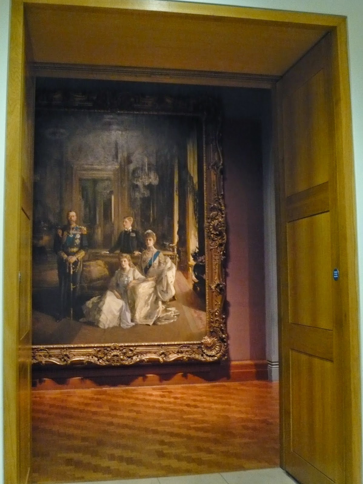
Then we came out of the lift on our way down and spotted this.
Huge.
Imposing.
Beautiful.


We got sidetracked.
Nearly three and a half meters high.
Four small people in a huge room?
A painting with an air of informality yet King George V is standing to attention?
Why is the Prince of Wales standing behind the sofa?
A family portrait not commissioned by the family themselves?
And where are the other three princes?


I felt better, less guilty.
I had looked at a painting.
So the visit hadn't just been all about breakfast after all.

Paintings and breakfast are available at the National Portrait Gallery.
Details on their website here.

Remember to keep your eyes peeled when coming out of the lifts!


Related Posts Plugin for WordPress, Blogger...